均值比较 (compare means)
在统计学中,我们常常需要比较两组或者多组之间的均值是否存在差异,计算差异的显著性, 同时也要用图形的方式呈现。这里推荐一个比较实用的R包,ggpubr (publication ready plot in ggplot2)。 ggpubr作图上与ggplot2无缝对接,同时也可以添加显著性的P值,对文章发表非常实用。
ggpubr
1 | # Instrall from CRAN |
均值比较的方法
- t检验 T-test (需要假设数据分布为正态分布,有参检验)
- Wilcoxon test (无参检验)
- ANOVA test (需要假设数据分布为正态分布,有参检验)
- Kruskal-Wallis test (无参检验)
作图数据集
1 | > data("ToothGrowth") |
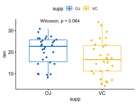
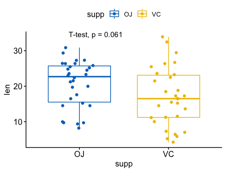
比较两个独立的样本
1 | p <- ggboxplot(ToothGrowth, x = "supp", y = "len", |
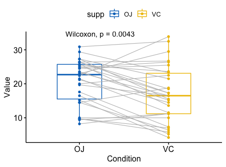
成对样本的比较
1 | ggpaired(ToothGrowth, x = "supp", y = "len", |
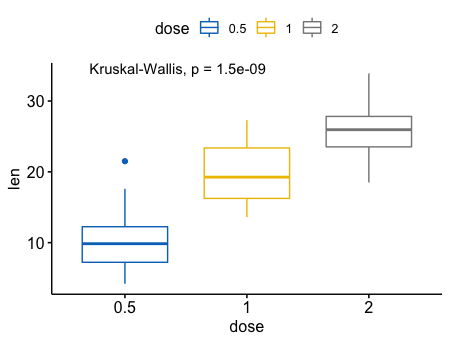
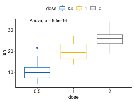
多组样本之间的比较(>=2)
1 | # Default method = "kruskal.test" for multiple groups |
1 | # Change method to anova |
指定比较组合
1
2
3
4
5my_comparisons <- list( c("0.5", "1"), c("1", "2"), c("0.5", "2") )
ggboxplot(ToothGrowth, x = "dose", y = "len",
color = "dose", palette = "jco")+
stat_compare_means(comparisons = my_comparisons)+ # Add pairwise comparisons p-value
stat_compare_means(label.y = 50) # Add global p-value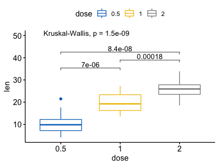
指定bar的位置
1
2
3
4ggboxplot(ToothGrowth, x = "dose", y = "len",
color = "dose", palette = "jco")+
stat_compare_means(comparisons = my_comparisons, label.y = c(29, 35, 40))+
stat_compare_means(label.y = 45)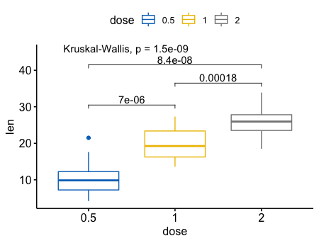
指定一个参考,进行多重比较
1
2
3
4
5
6ggboxplot(ToothGrowth, x = "dose", y = "len",
color = "dose", palette = "jco")+
stat_compare_means(method = "anova", label.y = 40)+ # Add global p-value
stat_compare_means(label = "p.signif", method = "t.test",
ref.group = "0.5") # Pairwise comparison against reference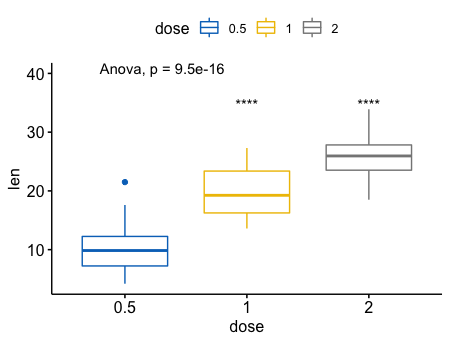
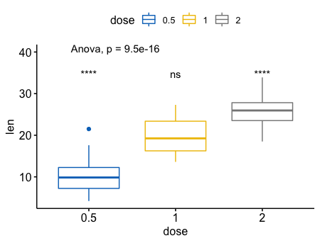
对于全局(base-mean),进行多重比较
1 | ggboxplot(ToothGrowth, x = "dose", y = "len", |
一个真实的例子 DEPDC1 在proliferation组中显著上调,在Hyperdiploid 和 Low bone disease中显著下调。 1
2
3
4
5
6
7
8
9
10
11
12
13# Load myeloma data from GitHub
myeloma <- read.delim("https://raw.githubusercontent.com/kassambara/data/master/myeloma.txt")
# Perform the test
compare_means(DEPDC1 ~ molecular_group, data = myeloma,
ref.group = ".all.", method = "t.test")
ggboxplot(myeloma, x = "molecular_group", y = "DEPDC1", color = "molecular_group",
add = "jitter", legend = "none") +
rotate_x_text(angle = 45)+
geom_hline(yintercept = mean(myeloma$DEPDC1), linetype = 2)+ # Add horizontal line at base mean
stat_compare_means(method = "anova", label.y = 1600)+ # Add global annova p-value
stat_compare_means(label = "p.signif", method = "t.test",
ref.group = ".all.") # Pairwise comparison against all
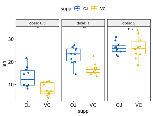
指定参数 hide.ns = TRUE, 隐藏ns。 1
2
3
4
5
6
7
8ggboxplot(myeloma, x = "molecular_group", y = "DEPDC1", color = "molecular_group",
add = "jitter", legend = "none") +
rotate_x_text(angle = 45)+
geom_hline(yintercept = mean(myeloma$DEPDC1), linetype = 2)+ # Add horizontal line at base mean
stat_compare_means(method = "anova", label.y = 1600)+ # Add global annova p-value
stat_compare_means(label = "p.signif", method = "t.test",
ref.group = ".all.", hide.ns = TRUE) # Pairwise comparison against all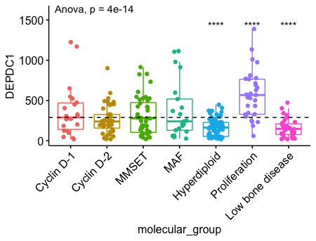
分页
1 | compare_means(len ~ supp, data = ToothGrowth, |
1 | p + stat_compare_means(label = "p.signif", label.x = 1.5) |
- 成对组合在一张图中
1
2
3
4p <- ggboxplot(ToothGrowth, x = "dose", y = "len",
color = "supp", palette = "jco",
add = "jitter")
p + stat_compare_means(aes(group = supp))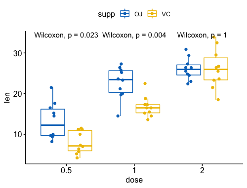
1 | p + stat_compare_means(aes(group = supp), label = "p.format") |
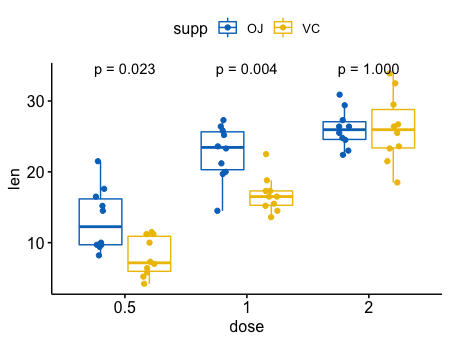
- 在分组后,成对比较
1
2
3
4
5
6
7
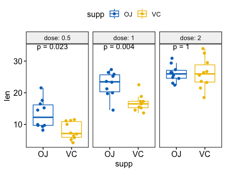
8# Box plot facetted by "dose"
p <- ggpaired(ToothGrowth, x = "supp", y = "len",
color = "supp", palette = "jco",
line.color = "gray", line.size = 0.4,
facet.by = "dose", short.panel.labs = FALSE)
# Use only p.format as label. Remove method name.
p + stat_compare_means(label = "p.format", paired = TRUE)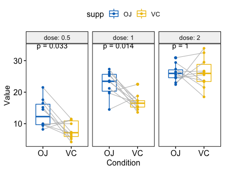
其他图形
柱形图和线图
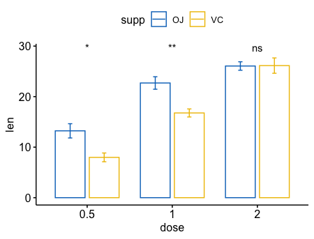
一个变量
1
2
3
4
5
6
7
8
9ggbarplot(ToothGrowth, x = "dose", y = "len", add = "mean_se")+
stat_compare_means() + # Global p-value
stat_compare_means(ref.group = "0.5", label = "p.signif",
label.y = c(22, 29)) # compare to ref.group
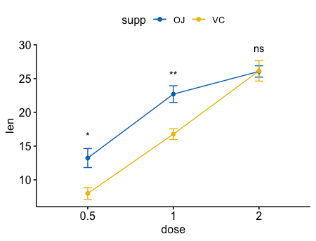
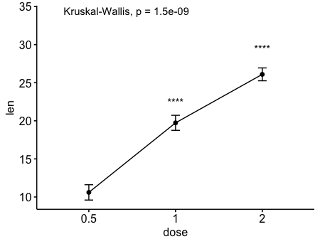
# Line plot of mean +/-se
ggline(ToothGrowth, x = "dose", y = "len", add = "mean_se")+
stat_compare_means() + # Global p-value
stat_compare_means(ref.group = "0.5", label = "p.signif",
label.y = c(22, 29))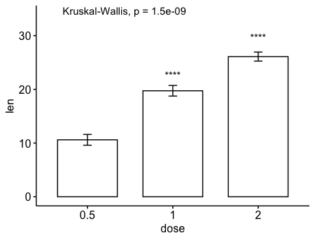
两个变量
1 | ggbarplot(ToothGrowth, x = "dose", y = "len", add = "mean_se", |